I found this
experience informative. It felt like such a privilege and responsibility to be
in the care of another artist’s work. To be the caretaker of their creative
process and voice. My opening reflection will echo my last statement; dynamic
between curator and artist is all.
I was drawn
to curate the work of Carolann Parr, a young female artist from Nottingham. She
is an extremely kind and thoughtful individual and her joy for connection with
others is mirrored by her desire to create in community and collaboration. Her
sweet and gentle nature meant that she wasn’t proactive or demanding in our
discussions about her work. This dynamic required a sensitive reply on my part,
and a gentleness too, if her voice was to come through in the plans for her
theoretical show. It occurs to me that this throws up opportunity and
challenge, just as the opposite dynamic would. Curating a very strong-minded
artist would be a completely different experience altogether.
I have spent
much time since we met almost 2 years ago now, talking about her work and her
process, and this helped me feel a sense of competence and confidence in
representing her curatorially.
Parr is a
multidisciplinary artist whose work explores relationship, connection and identity,
especially through natural systems. Her fascination and delight in the natural
world, plant folk lore, and the magic that both these enshrine, is loud in what
she creates.
The innocent
and nostalgic tones in her work are captivating and invite us to see the world,
and therefore ourselves, in a pure light. These qualities are a refreshing
contrast to the current tone of psyche, which is full of existential dilemma
and threat. In this way, experiencing an exhibition of Parr’s work could
provide a sort of spiritual medicine to her audience.
I wanted to
think out of the box, literally, with regards to where and how to show her
work. In my opinion, the intricacy, connectivity and wildness of gardens makes
them an ideal space to create and exhibit. And a natural background feels like
a perfect match for Parr’s whimsical and nature centric work. Bearing all this
in mind, I brainstormed some options for venue, as well as for the creation of
new work. and how it would be displayed.
I knew that
her upcoming project focused on medicinal and poisonous plants and so the
‘Plants That Kill’ area of Kew Gardens immediately came to mind. Likewise, the
Eden Project in Cornwall, with its architectural bowl and strong history of art
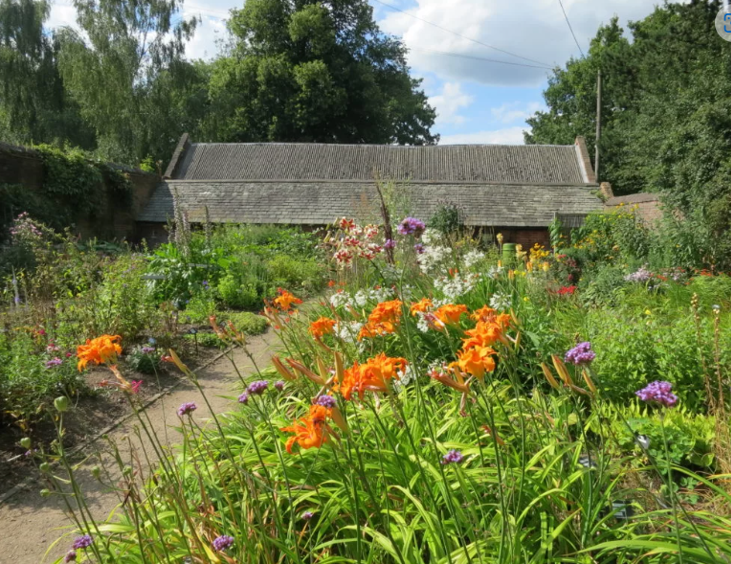
exhibition felt equally possible. St Ann’s Allotments (STAA) is one of the
oldest and largest allotments in Europe with many beautiful community spaces
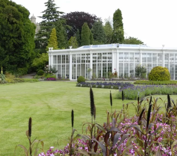
embedded across its site. And Wollaton Hall, another local site rich with
biodiversity, which is home to Camellia House, a grade II listed cast iron
glasshouse, one of the earliest and largest built in Europe.


I consulted
with her over the course of an hour, explaining my ideas and asking her for
feedback. She was happy with all my suggestions, but the venue she most
resonated with was Wollaton Hall. Her strong personal and creative connections
with the venue became clear as she spoke enthusiastically about Camellia House
specifically. The surrounding parkland is home to a riot wildlife and has
grassland, wetland and woodland habitats. The site also has a Lake, a volunteer
led Botanical Gardens, Walled Garden and many formal gardens too. Considering
its heritage, biodiversity, high footfall and Parr’s enthusiasm for the space,
we agreed that there was no better venue for her first solo exhibition.
Exhibiting
in a green space creates a unique opportunity to exhibit in relationship with
landscape, and so I suggested to Parr that she would exhibit some existing work
as well as generate new work in collaboration with the space and its
stakeholders; staff, visitors and the nature there.
I wanted to weave her desire to create
collaboratively into the exhibition too, and so I developed ideas around her
working with members of the local community on site to create work that related
to the space; ideally with a conclusion of generating a legacy sculpture or
land art piece.
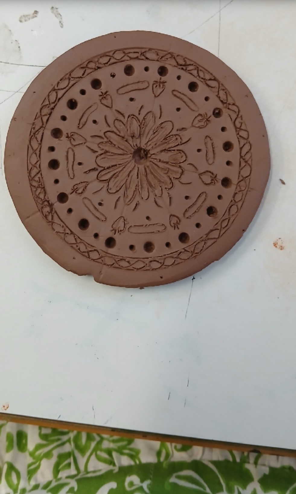
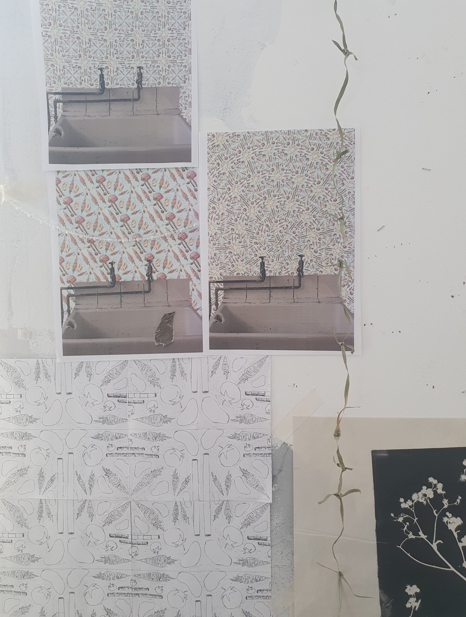
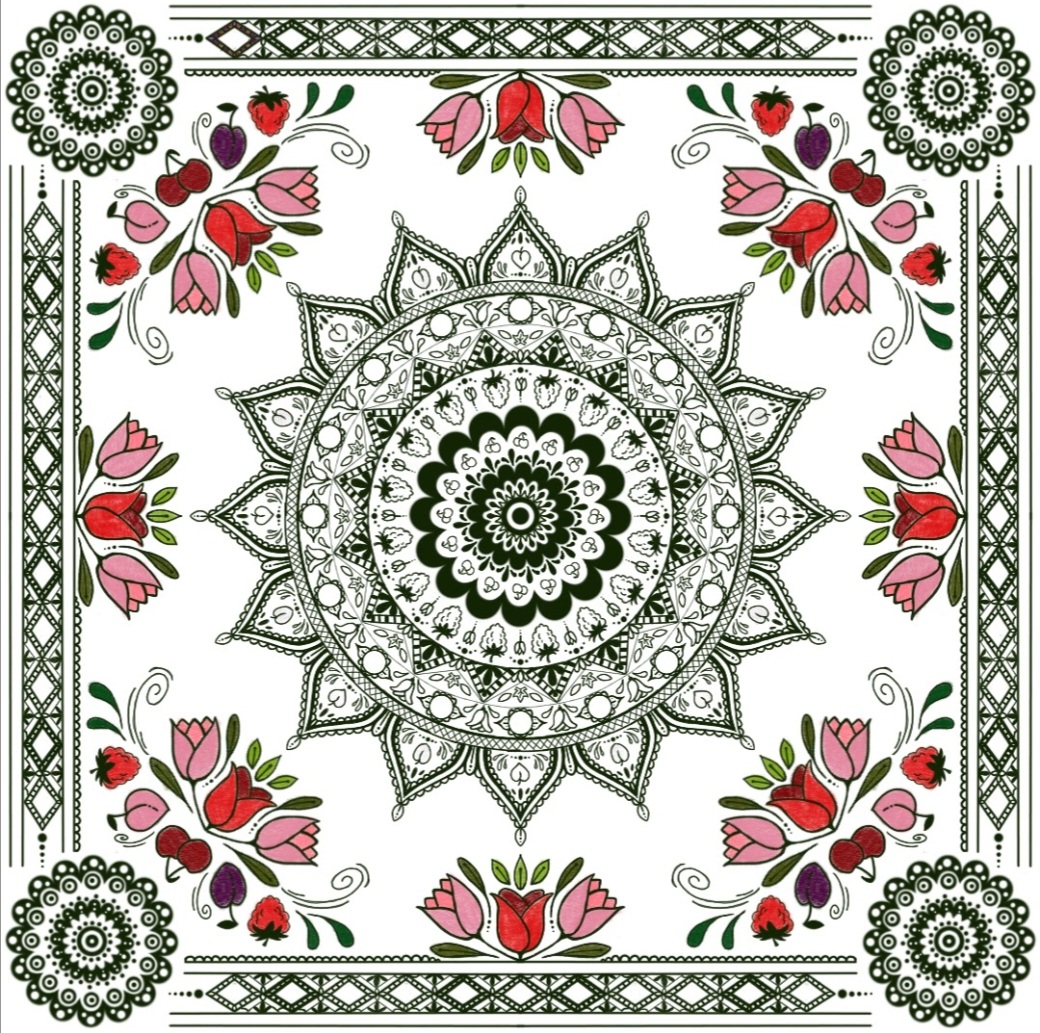
Pattern
creation and mandala are a common motif, and this aspect of Parr’s work lends
itself perfectly to surface pattern design.
I suggested
that she generate some ceramic tiles, featuring plants connected to the history
of the space, to be permanently installed in the kitchens situated in the
basement of the Hall, which are open to the public for educational tours. This feels
like
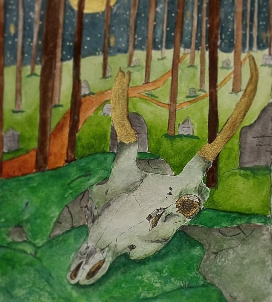
I also
suggested that a large print of her watercolour piece of a deer skull be
exhibited in the building or the grounds because of its relationship with the
herd of deer that have called the parklands their home for centuries now. It
would be fantastic it if could be projected large scale onto the side of one of
the site buildings during their light night or open-air cinema events.
For a third
aspect of Parr’s exhibition, to be shown in Camellia House, I suggested that we
would negotiate a type of residential, where she would connect with the space,
people who work there and who visit, creating work in response to the landscape
and its populations. I suggested that this would include a range of
printmaking, ceramics, painting and photography; these being the four main
disciplines that she works in. I suggested that this could feed into public
workshops and talks, fulfilling her desire to make collaboratively.
The fourth
suggestion of mine for her exhibition was that an element of the work that she
created in response to the site could be a land art installation; either temporary
or permanent. I suggested several notable artists that she could draw inspiration
from, Andy Goldsworthy, Richard Long and Christo and Jean Claude.
Reflections:
I was happy
to do my project on Parr, I have strong knowledge about her work and an
established interpersonal relationship with her. Both these things made it easy
for me to make curatorship suggestions and decisions on her behalf. This was
easy in a way because of Parr’s diminutive and passive nature. However, if I
had lacked that information about her and her work already, I think it would
have been a challenge to adequately represent her because of these same qualities.
I personally would prefer someone who was a bit more forthright about their
work and how it would be best curated, but that’s just a personal choice. The
reality of being a curator is that you are going to work with a huge range of personalities,
and so being flexible in this regard is essential.
I am happy
with my venue choice. It is highly relevant to Parr as a space. And giving her
the opportunity to partner work in her local area would build her professional
network and hopefully enable her career.
I think that
I approached the project in an unusual way, blending curatorial ideas for
existing work with the suggestion that Parr make new work in response to the
venue. I stand by this choice because making work in relationship with the
natural landscape it will be shown in adds an extra dimension and appeal. Context of artwork can either amplify or detract from it’s power, and so careful consideration of venue by a curator is pivotal to an exhibitions success.
The
suggestion of her surface pattern design being included in the kitchens feels
sound and I am happy with this idea. It’s a cohesive way to embed her work in a
historic setting and marries contemporary art with a historical site.
There is a
reclamation quality to someone from Parr’s background being exhibited in such a
space. Historically, working class people like Parr would have only had access to
the grounds in a servile capacity. And so, it is poetic that her artwork would
be exhibited in the very kitchens that she could have worked in a century ago.
In an era
where existential crisis looms large, there is an avant-garde aspect to the naïve
and romantic qualities in her work. Such art being displayed in a public space
would act like a kind of spiritual balm to her audience and I think there is
huge merit in this.
While I
suggested that Parr make work publicly and in collaboration with the public,
her lack of confidence may prove a barrier to this or make all together
impossible. I was trying to fulfil something that she often speaks a desire for;
public and collaborative making. But there must be a realism about this and on
reflection, maybe this was an over ambitious suggestion of mine.
I had positive
feedback about my presentation. People reflected that I spoke with confidence,
enthusiasm and clarity. I have my education and my professional background to
thank for this and I am fully aware of what a useful attribute it is to have.
This same
experience also gave me a good lens on the different needs of the venue and the
artist. Honouring both sets of needs is going to be key to organising a
successful exhibition.
I also had
positive feedback about the way that I had spoken about Parr’s work; folks admired
the ways that I uplifted and supported her as a person and an artist. I feel
strongly about the value of behaving this way within my creative community. We
should strive to lift one another up. It’s also just good professional practise
to be a kind and consistent individual. People remember this, and this kind of
conduct is the one most likely to yield you more opportunities in the future.
At the very least, it will stop you being excluded.
Overall, I
really enjoyed this project. The whole experience made me reflect on my own
work, on how I feel it would be best curated and how I would like to conduct
myself as a partner of galleries and curators. I think it’s a complicated role,
but one that yields beautiful learning opportunities and synergy.