Blog

  • BM 4: Printing and the value of found objects


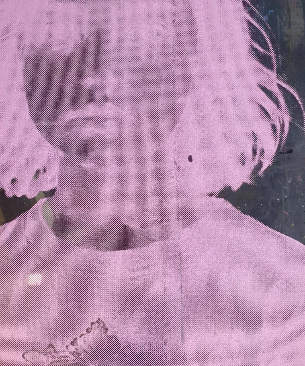
    The same child’s face is screen printed on reclaimed screen gauze in Miller-Baker pink, and suspended in succession using the marbles fixings in this found object; which is an old print drying rack leant to me by a kind technician. The marbles amplify the sense of childlike innocence already present in the colour piece. 

    Found objects like this are valuable because they encourage the audience to attach their own unique meaning to items.

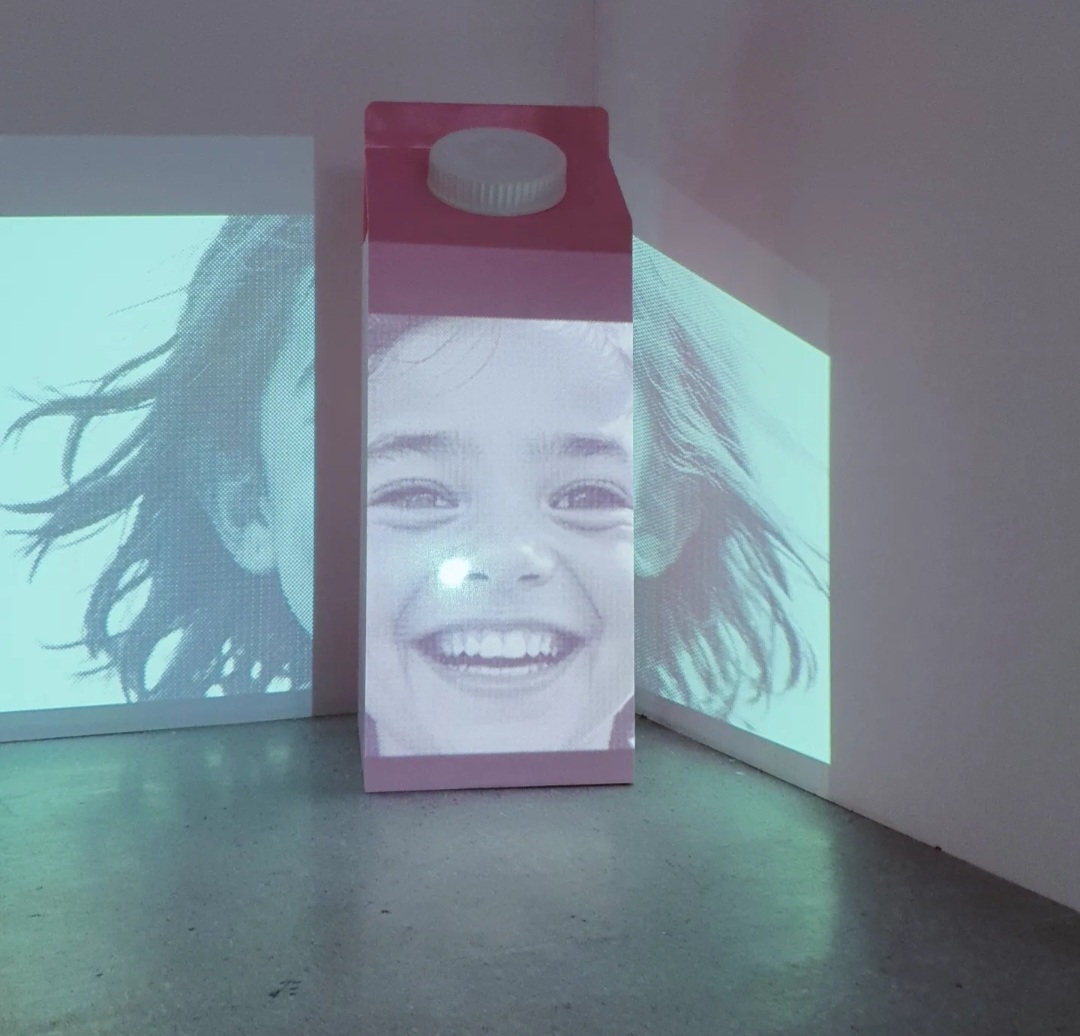
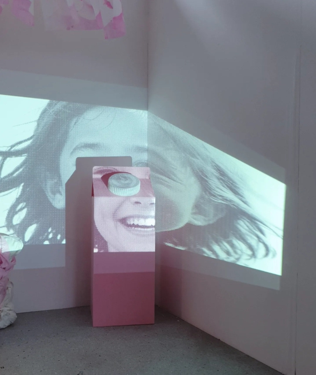
    I really tried to push the visual coding in this piece

    The repetition evokes the sense of a factory production line and sequencing; appropriate as this is an AI image generated by a machine using repetitive code. 

    The way that the found object allows the images to recede into the distance creates the feeling that it is a timeline repository or catalogue of some kind. 
    It also suggests the different versions of state that anything can become. That any human can become. This a suggestion of anything being possible creates an infinite quality. 
    I worked hard on creating paradox in the child’s expression. The image has a benign feel like a year book or passport photo. But it also feels loaded, akin to a photo you would see in a newspaper article about tragedy or criminal activity.

    I am pleased with this piece of the installation, largely because it was born entirely out of making experimentally, following my instincts unfettered, and exploring displaying my work creatively.

    I would like to explore the mechanism of sequencing/ layering images more in the future, after taking inspiration from other artists who work this way; including printing on different media and playing with scale and with the orientation of the panels. 

  • BM 3: Subversive stitch


    This is a totem of cloth. Of flesh, of hair and gape and wound and mend. Reminiscent of body parts, of a slumbering pile, of flesh that has been bound, of swell, it is both inviting and repellent.

    The Baker-Miller pink used throughout the installation is a complicated colour; implying both innocence and violence.

    I enjoy exploring subversive stitch more and more since I experimented with it in the portrait exhibition in Nottingham Castle. It feels especially poignant to explore this medium as a woman and it lends itself very well to my interest in trauma and healing as themes.

    I have never used hair before in my work. I have never used any literal part of me in my work before. This hair is a part of my story; it’s shedding was a symptom of an autoimmune condition caused by stress two years ago. There is a hopeful vulnerability in my keeping it close to me all this time with the belief that one day I would connect with it again. And it is cathartic to see it weaved into my work. Telling that story. Communicating.

    Hair emotes. We venerate luscious locks but can be disgusted by hair as a lone object. As a society, are very clear about liking hair where it “should be” and we take great pains to remove it when we feel the “need”. There is something visceral and animalistic about it. It almost feels supernatural, as it lasts long after the flesh perishes and still grows after death. There is folklore about it possessing godlike strength. And we often cut our hair as a trauma response. It is a powerful symbol.


    My pillow concept has evolved enormously since it’s inception. But the end result far exceeds my initial notions, and this is proof of the value of making without rigidity or unhelpful loyalty to an early idea. I have become softer, like a pillow.

    I was really happy with the composition of the piece but the position didn’t feel right. It was leant against the back wall and felt flat. I played about with its positioning in the space and landed on leaning it against a plinth off center mid space. It works so much better, the new position amplifies the sculptural quality of the piece and makes it feel plumper and more visceral. This curation choice breaks up the installation space and builds a better relationship with the audience; now they can walk around them, relating to them, rather than viewing them against a wall.

  • BM 2: Projecting on Perspex

    BM 2: Projecting on Perspex

    Creating this piece required that I throw myself into working with alien materials and new skills. It was ambitious and maybe a little fool hardy. But careful planning, practising with maquettes, determination and hard work paid off because it’s a powerfully pleasing object built to a high quality.

    Taking a thing with strong visual coding and blowing it up to 5 times it’s natural size makes it become more thematic in property than literal. Messing about with scale in this way really amplified the messaging of a piece and I want to experiment with this more.

    It’s really important to get the form of something right when it’s a familiar everyday object like a milk carton. People have a subconscious notion about what everyday objects should look like and unless you want to build tension in this way, not recreating it accurately could create disease in the piece. And so I have realised that paying meticulous attention to the dimensions and details is essential when you translate scale in this way.

    I know I’ve said it before but I really do fucking adore Baker-Miller pink. I want to work with it more.


    The portraits of the AI children slide off the milk cartons surface; referencing the missing graphics that used to be displayed on these objects in the 80’s. I used PowerPoint to create a simple but effective looping slide show with minimal glitch effects to add some bite and create a subtle but palpable uncomfortable, nervous tone.

    I played about with the positioning of the children’s face in relation to the surfaces. I made the decision that what works best is having their mouths sat on the milk carton top. It breaks up the image of the faces in an interesting way and suggests consumption and is slightly inappropriate, referencing child abuse and child pornography. I like how it’s not key stoned properly and wraps around the edge of the wall; the distortion adds more bite to the visual language and stops it being too literal.


    I’ve not experimented with large scale projections before but I have definitely caught the bug and will investigate this more soon. 

    I wish the projections could be bigger in size, filling much more of the space, but I have to accept the limitations of my access to budget and other resource right now.


  • BM 1: Reflections on the evolution of the piece and surrealist influences

    The effect of this piece reminds me the cloud paintings created by surrealist Magritte.


    “Clouds give space for contemplation, evoking dreamlike thoughts that float by us before disappearing.”

    “Through creating common images and placing them in extreme contexts, Magritte sough to have his viewers question the ability of art to truly represent an object. In his paintings, he often played with the perception of an image and the fact that the painting of the image could never actually be the object.”

    This piece has evolved a lot since its conception. When I began experimenting with the vessels the visual language felt stuck in a scientific slightly macabre place, reminiscent of a Gothic aesthetic like Frankenstein’s monster or wet specimens. Testing various ideas and reflecting on my results led me to this more reductionist screen-printed window format. The structure of the object still implies the viewing of an inner world, but in a more sophisticated way. It also speaks of the influence that my exploration into the Surrealist movement as a vehicle for discussing trauma has had on my work.

    I translated an AI image that I edited using Photoshop into a large scale screen-print. This screen is what I used to print the window box front pane of Perspex. 

    I really like this as a standalone piece. 


    Creating a framed object that could safely and sustainably contain liquid proved out of my resource, both timeline and budget wise. The compromise of building the piece out of wood and Perspex and adding the pillow stuffing to the interior cavity, which transpired from me playing around with the materials I had to hand, removes this issue while nodding to my original concept. 

    I think this end choice really works and it elevates the piece, with the Surrealist movement reference adding another layer of meaning.

    The use of directional lighting really sets the object off, creating depth and adding a transcendental quality; like sunlight breaking majestically through scenic cloud.

    Curating the piece on the floor, rather than on a shelf or plinth, translates it into a sculptural work, which again adds interest and value.


  • Artist statement for end of year exhibition 24: “I am part of all I have met: BM1, BM2, BM3, BM4”


    ‘I am part of all I have met: BM1, BM2, BM3, BM4’

    Bethan Hemus, 2024

    This installation explores how and what we nurture. As a mother, this is a literal conversation for me. And it is a metaphorical conversation for most, in an Era where technology evolves and populates our society at an unprecedented rate.

    I created the images of children that fill the space using AI. The topics of AI and childhood are twinned in this work because they are similarly emergent in nature. The direction each walks is inevitably influenced by their environment and by human interaction. 

    The associations that we have with fabric being close to the body and sensory lends it well to discussions about the human condition. The textile pieces in this work reference individual and collective wound and repair. The cloth has been worked heavily and embellished with human hair. It’s energy is paradoxical; it feels warm and intimate but at the same time lifeless and revolting.

    The use of Baker-Miller pink throughout amplifies the paradoxical nature of the installation; referencing both innocence and violence. This complicated tone bounces around the installation and is an invitation to consider the duality of the subjects presented. 

  • Video glitch edit in PowerPoint

    Video glitch edit in PowerPoint

    I originally created a simple slideshow with the AI child portraits for the installation projection but it didn’t have enough edge. 

    After some research and experimenting, I found a bunch of great techniques for editing using PowerPoint. 

    I like that I could create this effect using something as basic as a piece of Microsoft Office software.

    The final video has loads more tension and ambiguity.

    YouTube link to video edit without sound


    Resources:

    Glitch video effect edit link

    Glitch sound effect pack download

  • Screen printing large scale and reflections on the need for creative community

    Screen printing large scale and reflections on the need for creative community

    I scaled this print up so that it will fill the window pane space and printed using BM pink.

    It is the largest screen I have ever made and Tony was super helpful in making it and also actually helping with the printing as the paddle is so big that it needed 2 people to use it. 

    Throughout this process I have had it made really clear to me that having a tea, a community, is essential. You can’t do this on your won and I couldn’t feel more motivated to connect with an artist hub/ studio space soon.


    DID I MENTION I AM OBSSESSED WITH THIS COLOUR.

  • Thinking about curation and editorial decisions in installation space

    When thinking editorially about my exhibition space, I was reminded of Dorothea Tannings cumulative installation Poppy Hotel.


    Creating a space that the audience either views or that they walk through is an important decision. Do I want my audience to feel a bystander and witness, or a participant in this instance?

    Tom was helpful in encouraging me to be reductionist in my end of year exhibition content. I originally had more work that I wanted to include but I already have several strong pieces and he is right when he says that less is often more; sometimes the clutter can make everything compete with one another. Taking out the less strong work gives what is left space to breathe. 

    I have found the process of curating my space interesting. I think it’s a really important skill and I want to develop this next year.
  • Jessica Lewis

    Jessica Lewis

    Another local artist was motivated to use hair as a medium at the same time as me; it’s a great example of the 100th monkey effect. She tapped into the same reactions and psyche as I have; that folk find it disturbing and reassuring in equal measure.