Category: Uncategorized

  • Feminist Interventions

    Feminist Interventions

    The French artist Jean-Honoré Fragonard painted the perceived masterpiece of Rococo art, The Swing, (c.1767-1768).

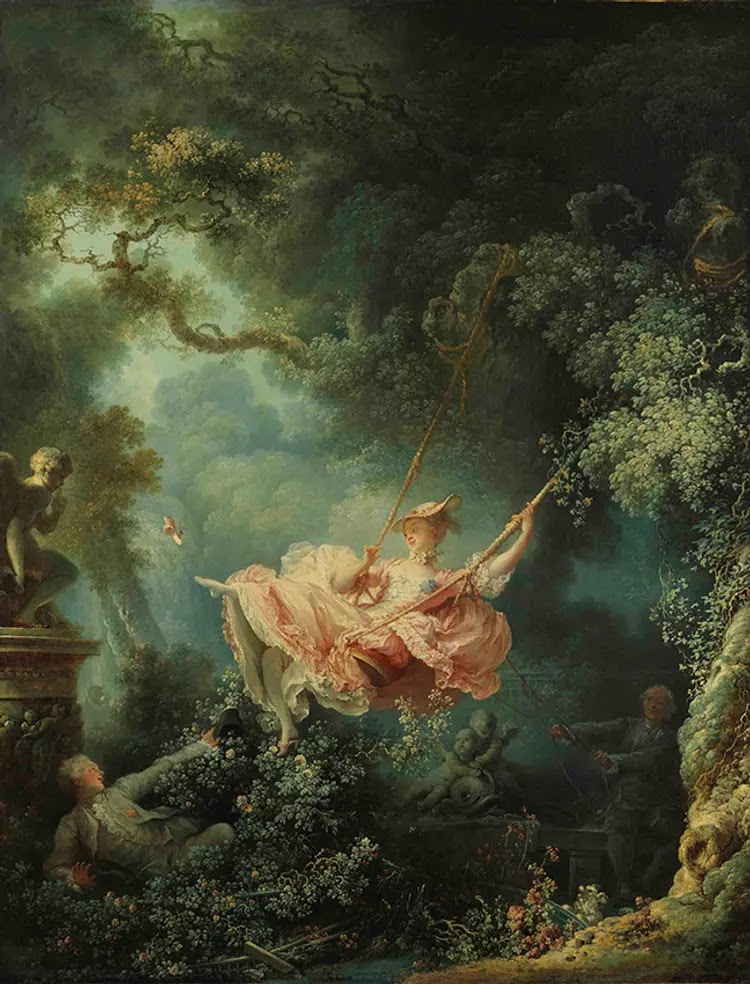
    The painting illustrates a covert type of sexual voyeurism known as upskirting, and is rich with erotic symbolism; exploring desire, adultery, love, and power. The woman is both subject and object: she is central in the composition, and is also the object of desire for the men. She is held in place between both and yet just out of their reach, suspended in mid-air. 

    “The woman is a symbol of desire and infidelity…. with her lover in the bushes gazing up at her, peeking into her open dress. The voyeur behind her, possibly her husband, is holding on to her through the ropes attached to the swing, which could also imply his power.” 

    This decadent celebrated painting was commissioned by a Baron who wanted a portrait of his mistress, and so it a meta representation for objectification of the female body and the male gaze.

    The contemporary artist Yinka Shonibare was inspired to re-enact this painting in a multi media installation called The Swing (after Fragonard), (2001).


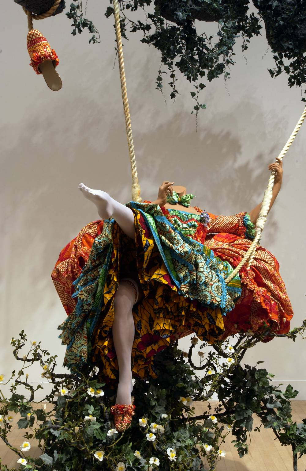
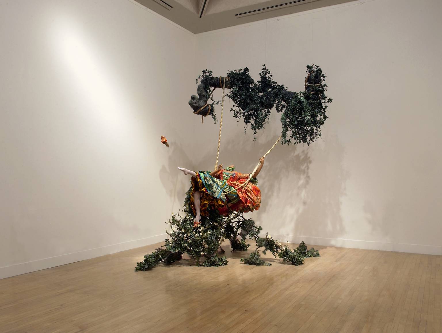
    By recreating the painting in three dimensions, Shonibare offers us the option to upskirt, but also to place ourselves in the position of either male in the painting. 

    “The sensuality of the original painting is maintained and critiqued in Shonibare’s version. The opulence of her dress and the frivolity of her gesture, swinging languidly across the gallery, make Shonibare’s figure a direct translation of the Fragonard original. However, Shonibare’s coquette has no head, which may allude to the literal fate that awaited the aristocracy after the French Revolution; only twenty-five years after Fragonard painted The Swing, the guillotine was introduced in Paris to more efficiently execute royalist sympathisers.” 

    The work is both unfamiliar and instantly recognisable; and this generates a sense of discomfort in the viewer similar to that evoked by the sexist and toxic themes highlighted so clearly in the original painting.

  • Britton Sherpard

    Desire paths: Part 1

    Intuitive Wayfinding + Accurate Design

    Desire paths have always existed in the built environment, and go by many names: desire line, cow path, goat track, use path, beeline, sheep path, social trail, bootleg trail, coffin path, shortcut, and Indian corner are a few. Usually, a desire path is the preferred path, an alternative way to go that solves a particular problem or makes more sense than the walking path provided. Once taken, the innovated path is followed. 

    Here, tracks in the snow record and reveal a poetic, fleeting quality of creatures moving through the landscape, evocative of landscape architects drawing on trace paper. They also suggest the in-the-moment, emergent nature of desire, organization, and way finding. In the center image above, regular snow shoveling follows the known desire paths of plaza users. On the right, trodden down snow is slower to melt, revealing a photo-negative desire path.

    There are many strong precedents for the reading of desire paths in design…more on that later.


    (Source: https://www.seattlelandscaping.com/landscapearchitectureblog/2016/3/1/desire-paths)


    Desire paths: Part 2

    A human connection to interface design

    There are strong precedents for the reading of desire paths in design. Computer software development gives us one model for taking advantage of user feedback. “The desire path is the most common metaphor I use to explain how to introduce new tech to users” says one designer. 

    In general, it can happen very often that designers will assume that they know what people need for successful navigation of a site. But emergence of successful way finding is continual, and software developers are always in search of new interface architectures. Their research takes advantage of measuring tools which evaluate efficiency. Heat maps measure and record where peoples’ eyes move and locate as they use a site, and click-through pathways  show how closely use patterns match up with the design intent of a site. “When you put barriers in the way of your users, [for example] in the form of content they are not interested in,” there is a measurable limit to how much time and effort they will invest in finding their way around before leaving your site, “even if your organization thinks that content is your central mission.”

    In some circles, this type of human-computer interaction has become known as paving the cowpaths. Developers investigate “users’ mental modes of site structure” in order to understand the behavior paths instinctively followed(5), and have learned that rather than influencing user behavior, it is better to allow for site interfacing which instead simply reflects  observed behaviors.

    The idea that authorship is less important to designers than efficiency has roots in open source culture,  the foundation of internet usability, and, increasingly, a norm in professional and cultural collaboration. “Open data started as simple file sharing…where datasets were linked through common formats, and available to anyone for download.” Open source is a malleable infrastructure which works like a “road network” of user “footstreams,” always evolving through repeated optimization.

    Returning to the physical environment, snow is often where we see desire paths being traced anew. One detailed account of desire path observation used by planners involved geography graduate students at the University of Toledo, who observed and recorded transit patterns of students crossing the main quad left in the snow all winter. They kept track of use patterns by counting students and mapping pathways and their relative strengths. The new layout was transposed to the site and built in the summer.

    Desire paths are very old and very new. They are the word on the ground and record peoples’ particular interpretations of time and place. For groups who want to learn more about how individuals and communities move around in their space, they are a source of information. People are fond of desire paths because they are light-hearted, even humorous, at times poetic, and tend to have a bias of common sense in place. And they are a plainly visible language accessible to designers and planners.


    (Source: https://www.seattlelandscaping.com/landscapearchitectureblog/2016/3/2/desire-paths-part-2)

  • Drawing with tape

    I traced images of my 3D poppy heads because their pleasing sculptural forms came up well in some of my documentary photos and I felt this would translate well into this graphic medium.

    I experimented using masking and electrical tape, crudely tracing the outline of two enlarged photographs, trying not to be too “tight”. 


    I overlaid both on top of black paper, which I think this adds an extra dimension, an extra layer of depth. I found that the starkness of the electrical tape meant that the poppy head drawn in black translated better than masking tape, which has a softer quality. However, I do like the juxtaposition of both and think that they work well when they are in relationship.


    I created a third traced image and overlaid this again.

     I am really pleased with the graphic qualities and the interplay of all three layers and would like to work with these images further.


  • Art or Design

    Art or Design

    Artists have creative freedom to explore what they would like to talk about, evoking thoughts and feelings through dialogue. Where as designers work from a brief that is particular and has specific requirements. Design usually demands functionality and often has to problem solve. 


    “Design is not art. Design has to function. Artists primarily work off instinct, whereas designers employ a methodical, data-driven process.” (Source: https://www.toptal.com/designers/creative-direction/art-vs-design#:~:text=%E2%80%9CDesign%20is%20not%20art.,%2C%20data%2Ddriven%20process.%E2%80%9D)


    That said, there can be overlap between both.


    To explore these definitions more, I will look at one designer, one artist and one designer who blurs the boundaries between both disciplines.

    The designer I have chosen is Bethan Gray. Her website states “Bethan tells cultural stories through craft and design, creating best-selling collections of luxury furniture and homeware that are at once decorative and highly original, while remaining comfortable and functional.” (Source: https://bethangray.com)


    This is a Bethan Gray pattern called Inky Dhow and is inspired by the sails of Dhow boats; traditional Arabian sailing vessels, whose sails are made from fabric strips which are sewn together. Her inspiration for the design is easily understood when we read about her heritage: “Born to a Scottish father and Welsh mother, her maternal family descends from a nomadic Rajasthani clan that migrated across Arabia and Persia over centuries. Inspired by her heritage, and fueled by a deep-seated curiosity about global art and culture, Bethan has travelled to India, Asia, the Middle East, Northern Africa and South America.”  

    The fluid lines are meant to capture the movement of the sails of these ships billowing in the wind and she drew the original design using ink; hence the name. It is a pattern that repeats throughout her work, almost like a signature.


    Inky Dhow features in a collection of furniture, including cabinets, tables, ceramics and sofas. Even though the surface pattern of each piece is richly conceptual and decorative, the pieces themselves are functional objects that have a specific purpose; i.e. they are a comfortable, ergonomic and practical sofa. 

    The stories section of her website explains: “She works…. to bring contemporary design and technology together with traditional craft, resulting in furniture and home accessories that give endangered skills new relevance in commercial markets.”

    Contrastingly, the designer Dewi van de Klomp’s ‘Soft Cabinets’ are pieces of furniture that exist more to create dialogue around everyday household materials than they do to be functional objects; although they can be used as furniture too.


    The Dutch designer “started to experiment using a foam found commonly in household furniture, making a series of objects in an attempt to show the material’s “poetic side”…. The foam furniture collection comprises a series of shelves in different shapes and sizes that take on new forms depending on their contents, bending and warping as books, magazines, plates or glasses are slotted inside…. “The cabinets seem almost alive,” said the designer, “protecting their content while carrying them in their own way, questioning and challenging our vision of strength and resistance and therewith the material used, in a very poetic way…. Each of the pieces are cut by a machine before being finished off by hand, and are produced on-request only. ” (Source: https://www.dezeen.com/2020/08/13/dewi-van-de-klomp-foam-furniture-soft-cabinets-design)

    With this series, she is intentionally flirting with design boundaries. When asked about these pieces, she said: “The work is not about having the most functional cabinet, but rather they are showpieces. Literally, they are designed to show your nicest books or dishes. Not the stuff you are using daily, but the stuff you love so much you want to show it off. But also, in a figurative sense, the cabinets show the foam material in its purest form,” she added. “They are designed to make you start appreciating the material and to show off the material itself.” (Source: https://www.dezeen.com/2020/08/13/dewi-van-de-klomp-foam-furniture-soft-cabinets-design)

    The artist I have chosen is Andy Warhol. His piece ‘Little Electric Chair’, part of his ‘Death and Disasters’ series, is a portrait of ‘Old Sparky’, one of the electric chairs used to facilitate the death penalty in the US. He made his screen-print the same year that this chair facilitated it’s last two executions in New York. He used an eerily over exposed press photograph as his source of inspiration and applied a clashing palette range to amplify the disturbing quality of the original image. 

    He went on to produced multiple versions of this image, to explore how we can become desensitized to horror and brutality the more we are exposed to it. 

    This piece of art exists to facilitate dialogue about the death penalty and the controversy that surrounds it as a political and moral action. That is its function, and this brief was set by Warhol, all be it steered and informed by his social context.

  • Photograms

    I made a test strip, exposing different sections of photographic paper to increasing periods of light. This was a useful tool that helped me familiarise myself with the equipment and gave me a sense of how to achieve the exposure and tone I would like in the future.
  • Monoprint

    I created several monoprints by drawing, mark making and tracing images onto sheets of newsprint.


    I enjoyed experimenting with different tools to make marks with a range of qualities and create texture; my (unexpectedly) favorite tool was a wire scourer. 
  • Authorship: Janaina Mello Landini


    Authorship refers to the creator of a work of art, or the creator of the artistic concept(s) that that work explores. 

    To elaborate on this I have chosen to look at the work of an artist and unpack what defines their unique creative voice.

    Brazilian artist Janaina Mello Landini “studied architecture and later fine arts at the Federal University of Minas Gerais. Fascinated by mathematics, logic, and architecture, (her) detailed paintings and textile works juxtapose the rigid logic of man-made structures with the wisdom of organic forms. Her paintings frequently take on the Fibonacci sequence and other patterns found in nature.” (Source: https://www.artsy.net/artist/janaina-mello-landini)

    Using nylon rope in a rainbow of colours, she makes installations inspired by the various networks and systems that fascinate her including tree roots, human anatomy and computer programming.


    She “unbraids lengths of rope to create fibrous labyrinths that breach canvases’ edges and crawl from floor to ceiling. Including both sprawling site-specific installations and smaller pieces confined to a few dozen centimeters, the São Paulo-based artist’s body of work is broad. All of her projects, though, explore tension and space as they spread into arboreal forms or perfectly round networks.” (Source: https://www.thisiscolossal.com/2020/09/janaina-mello-landini-rope-artworks)

    Her sources of inspiration, the mediums that she employs, her narrative and how she exhibits her makes are all consistent and this gives her a vivid, authentic and easily recognizable creative voice as an artist.
  • Translation: from sketch to wire to fabric

    I chose to use dried bread seed poppy heads from my allotment for this project because they are beautifully sculptural and have an instantly recognizable shape. I grew them myself, used some of their seeds for baking and shared the rest out among a local seed saving circle that I am a part of, so I feel intimately connected to these objects.


    I found translating my line drawings into a wire form surprisingly uncomplicated and satisfying. This is testament to how my passion project, The Forest Folk, has evolved my 3D making. Historically, I have struggled with this kind of work but from the off I had a strong instinct for how to build this form in a methodical way that achieved what I wanted aesthetically but was also robust and stable. This was a really empowering experience and I feel galvanized to approach 3D making more from now on.


    I like how the wire frame looked naked, and I like it covered with paper and tape; both feel pleasing to me and each embody a kind of unique “poppy-ness”. The skeleton quality of the wire frame, the way it loops, flows and curves softly, feels inherently organic and natural. This is interesting being as it’s made from metal, and so in that way is contradictory.


    I spent a long while carefully shaping the paper and tape skin to really define the ridges and joins of the sections and this attention to detail was worthwhile as it has created the illusion of an animate botanical thing. It was quite an absorbing meditative process, which I enjoyed.


    Translating this form into fabric felt like a playful adventure and I am happy with the result. Again, I was pleasantly surprised by how naturally I was able to problem solve the task. My instinct to stitch the piece with seams facing outwards feels correct as it has added to the ridges of the seed head shape. Even though it’s a floppy version, it has still retained some notion of being a poppy. A floppy poppy.


  • Reimag(in)ing The Victorians @ Djanogly Gallery

    This exhibition explores how leading contemporary artists have invoked the Victorians in their work. 

    The first room explored different aspects of colonialism and the political and cultural impacts of the not so Great British Empire. 

    There were tinted photographs by Ingrid Pollard. Her versions felt like a tender and apologetic subversion of the motivations for the original images, all of which were captured and shared to promote Jamaica to potential British investors and developers. The delicate way they have been hand coloured made the people and places in them come alive. You could feel the gentle and sweet intentions of the artist.


    The Yinka Shonibare mannequins in the same space really stood out for me, with their beautifully vivid African prints and globe heads. This kind of work feels especially important at a time where we are revisiting our national identity and having dialogue about how we tell our history in relation to racism and colonialism.

    The second room was full of natural history specimens and related art made by women, including drawers from Florence Nightingales shell collection and this intricate watercolour by Ann Seaton.


    The third room featured a fantastic mix of modern and traditional taxidermy, natural history specimens and art and sculpture. This was my favorite section of the exhibition. I resonated with the majority of the artists shown, including Kate MccGuire who made this writhing feathered serpent. It is typical of her work, embodying both enchanting and repellent qualities.


    The mouse skull sphere made by Alistair Mackie was an exquisite contemporary twist on traditional taxidermy. I spent a long time admiring this piece, trying to understand how it had been constructed; there were no visible joins or scaffolding and it really looked as if it were held together by magic. I also enjoyed reading that he only uses skulls foraged from owl pellets he finds in the wild. I think this is a beautiful collaboration with nature and a leaning into a natural process that references death in a healthy cyclical way. Maybe that is why he chose to create a sphere, to represent the life and death cycle his make connects with.


    There were several Tessa Farmer pieces including this powerful example of her work called The Intruders which was suspended individually by fishing line from the ceiling, giving it a dynamic quality as it swayed slightly in the breeze. Her work is macabre, emotive, folkloric and breathtakingly intricate. Her pieces have such strong narrative and you can easily imagine, when you look at The Intruders, that you are witness to a fierce battle frozen in time. I am fascinated with and inspired by her work. 


    The last room showed a range of photographic portraits, mostly taken by female photographers, including Julia Margaret Cameron who pushed the boundaries of traditional portraiture into a more intimate and creative place. This room also looked at the technological advancement of the camera during the 19th Century. 

    Although I have not spoken about it in relation to individual pieces yet, there was a strong feminist narrative running throughout the exhibition. There were myriad reflections on forgotten women, uncelebrated women and how the attitudes of society formed towards girls and women all those years ago can still prove limiting and toxic today.


    I was thrilled to visit this exhibition and came away feeling full of reflection and awe. I admired the contents and the curatorship equally. The gallery space felt cohesive, engaging and powerful and the experience took me on a journey through different aspects of the Victorian personality and the legacies of that Era.